
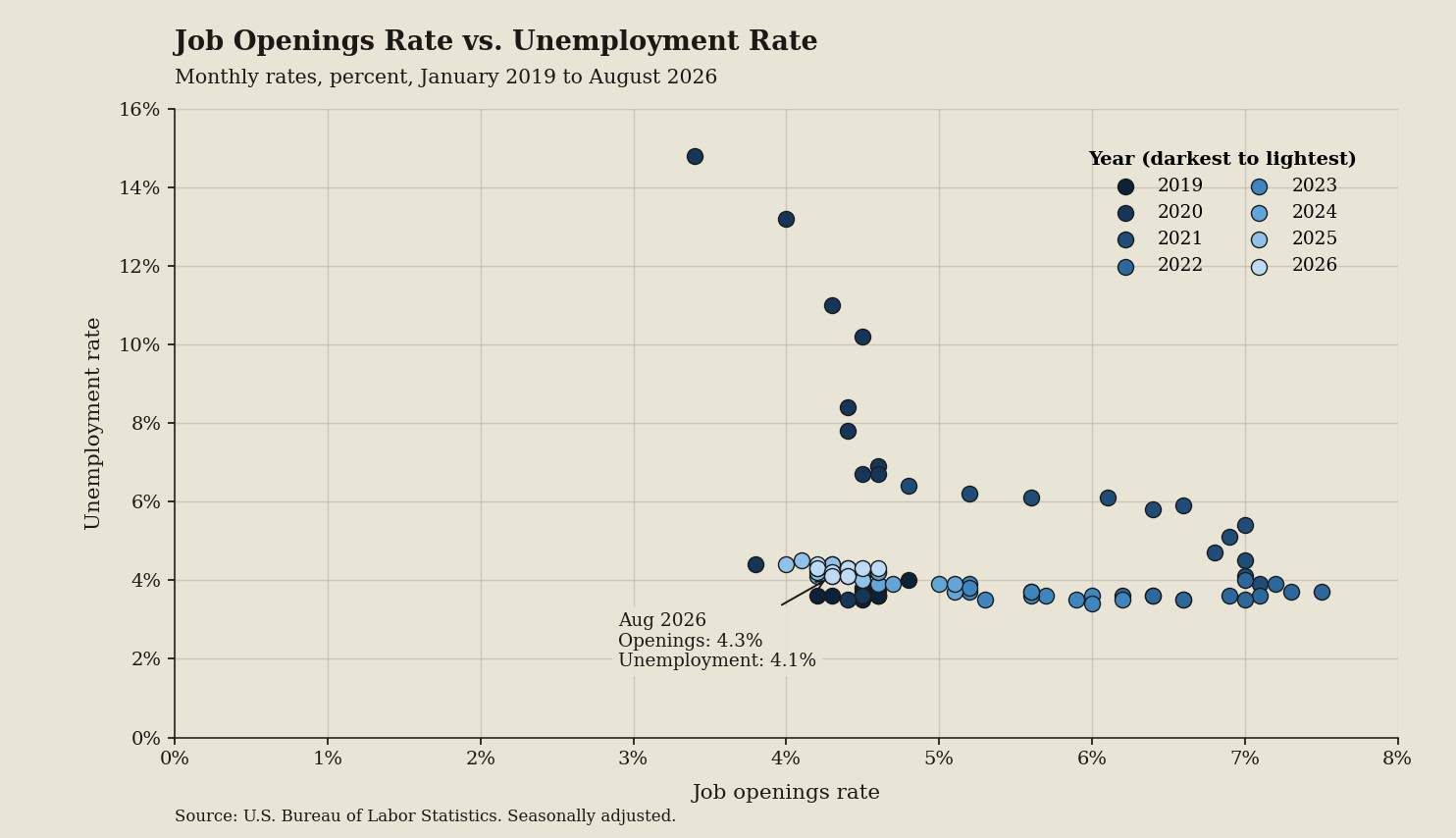
Recruiter chatter insists hiring is frozen solid, but I pulled the numbers directly from the Beveridge Curve chart package to map vacancies against unemployment. This scatter plot shows job seekers that hiring friction stems from matching inefficiencies rather than disappearing jobs.
Key takeaways
- The August 2026 point sits at an openings rate of 4.3 and unemployment rate of 4.1, indicating steady baseline hiring.
- Unemployment rates peaked at 14.8 before falling to 3.4 across 92 plotted points, reflecting a dramatic labor recovery.
- Horizontal openings rates span 3.4 to 7.5, showing that employer vacancy demand has cooled from past record peaks.
- Points shade from 2019 darkest to 2026 lightest, moving inward toward balanced conditions where job seekers face normal competition.
What the terms mean
- Beveridge curve: a scatter plot comparing unfilled vacancies to unemployment to show hiring match efficiency.
- Job openings rate: the share of jobs left vacant in the Job Openings and Labor Turnover Survey.
- Unemployment rate: the share of jobless workers looking for work in the Employment Situation news release.
What to watch next
Watch whether points in the U.S. Economy at a Glance overview shift up and right, proving markets cannot match rather than refusing to hire.