
The industry heat map
I pulled the August 2026 Employment Situation news release, the monthly government hiring report, to map a year of industry changes. Asking who profits from a broad total nonfarm payrolls headline, the total worker count, points to resume vendors; meanwhile, the Current Employment Statistics program, the business jobs survey, proves your leverage depends entirely on your sector.
Key takeaways
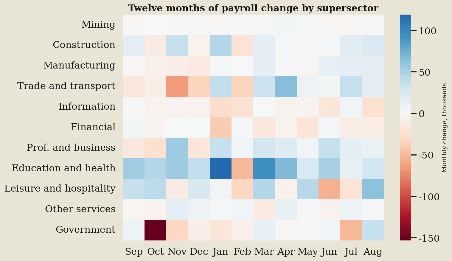
- Education and health posted the largest blue cell, gaining 119,000 in January; this structural demand gives applicants total leverage.
- Government printed the largest red cell, losing 153,000 in October, proving public roles offer no immunity against sudden cuts.
- Information showed the most red cells, falling in 10 of 12 months; this persistent chill drains applicant leverage.
- The latest August column is red for two sectors, Information and Financial, meaning candidates there face immediate employer resistance.
What the terms mean
- Employment Situation news release: This is the monthly government report detailing national hiring and unemployment.
- total nonfarm payrolls: This measure counts U.S. workers outside farming and households to show overall market direction.
- Current Employment Statistics program: This official government survey of businesses measures the number of industry jobs.
- U.S. Economy at a Glance: This government dashboard summarizes current labor and economic metrics for a quick market read.
What to watch next
Watch the U.S. Economy at a Glance dashboard for a column that stays red; that is a lane going cold, not a noisy month.