Participation is the quiet line under the jobs print
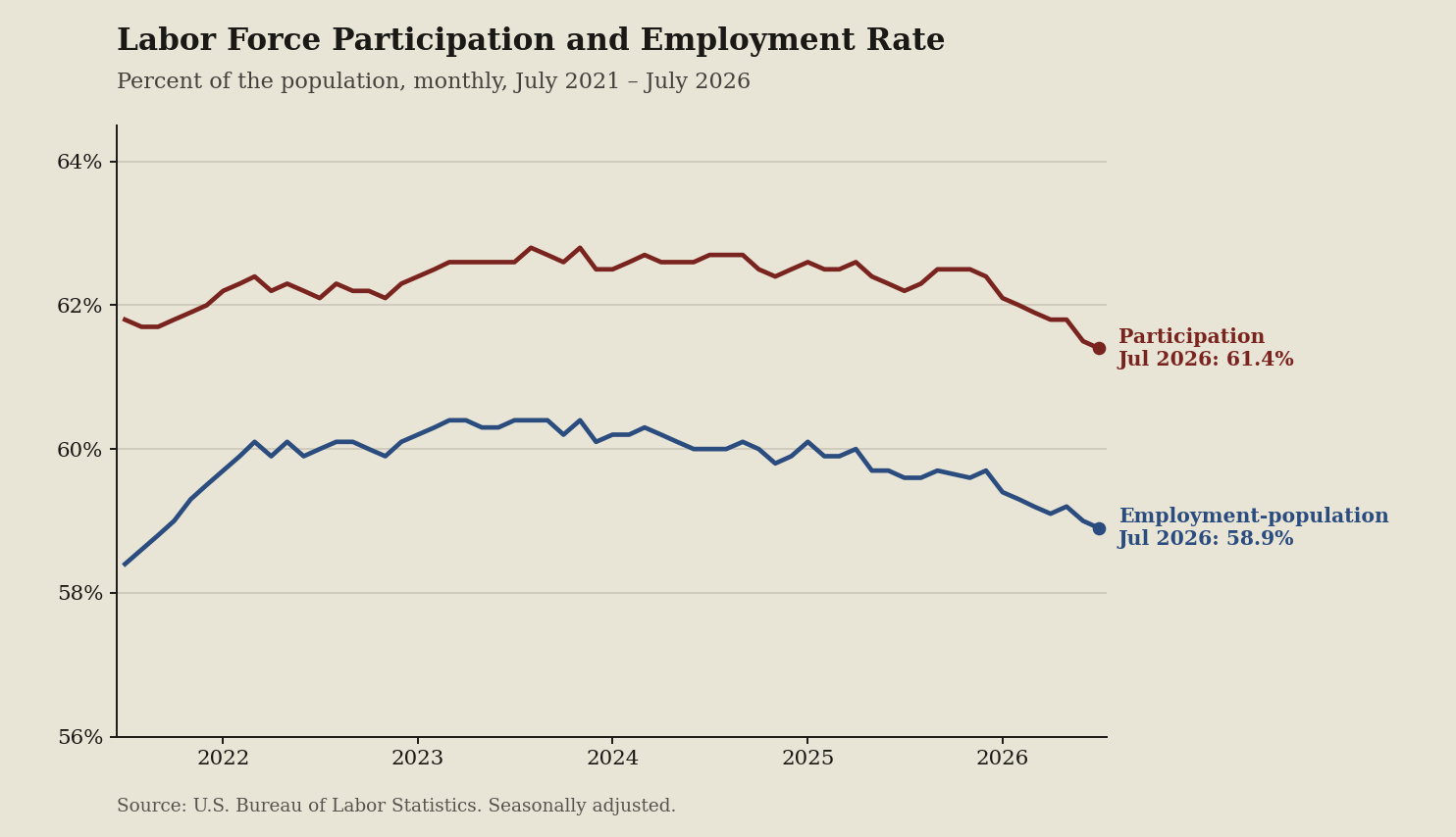
The headline unemployment rate gets the press, but the quiet lines underneath tell you who actually stayed in the game. This chart shows the share of Americans working or looking for work against the share that actually have a job, giving job seekers a clearer look at their real competition.
What the chart shows
I pulled the July 2026 jobs filing using a government data API. The vendor copy on the television focuses heavily on the standard, seasonally adjusted unemployment rate. The documentation tells a different story. If you look at the U.S. Economy at a Glance table, the labor force participation rate sits at 61.4 percent. The employment-population ratio sits at 58.9 percent.
The gap between those two numbers is your actual market friction. The standard unemployment rate only measures the people who are actively looking. When the participation line drops, it means people are walking away completely. They stop applying, so the government stops counting them as unemployed.
What the terms mean
Reading the government file requires knowing the vocabulary. Here is the plain language translation of the metrics used above.
- API: Short for Application Programming Interface, this is the software bridge that lets computer systems pull data directly from government servers without a human clicking a download button.
- Seasonally adjusted: A mathematical filter the government applies to the raw data. It removes predictable seasonal spikes, like retail hiring for the holidays or summer agricultural work, so we can see the true underlying economic trend.
- Employment Situation: The official monthly news release from the labor department that provides the national jobs snapshot.
- Current Population Survey: The official household survey conducted by the Census Bureau for the labor department, which asks a sample of people if they are working. This is where the participation numbers come from.
- Labor force participation rate: The percentage of the civilian population age 16 and older that is either working or actively looking for work. If you stop looking for a job, you drop out of this metric.
- Employment-population ratio: The percentage of that exact same adult population that actually has a job.
- Federal Reserve Economic Data: Often referred to as FRED, this is a massive public database run by the St. Louis Federal Reserve that charts thousands of these economic series over time.
Why it matters if you are looking for work
Ask yourself who gets paid if you only look at a low unemployment rate. The people selling you optimism benefit. A falling participation rate can make the job market look tighter than it actually is. If unemployment goes down simply because a million people gave up and stopped looking, you do not actually have an easier path to an offer. You just have invisible competitors waiting on the sidelines.
Employers understand this dynamic. When the participation rate is flat or falling, hiring managers know they have the leverage. They know the pool of active applicants is artificially small. If they need to, they can pull people off the sidelines by offering a slight premium. If you are negotiating an offer while participation is dropping, you are negotiating against ghosts.
What to watch next
Watch the spread between these two lines in the next print. A falling participation rate can make unemployment look calmer than the hiring market feels. Pay attention to whether people are entering the market because higher wages are pulling them in, or leaving it because the hunt simply took too long.