The jobless rate is not one color, and the gaps did not close
I pulled the Employment Situation report, the government's labor scorecard, to reveal how the jobless rate splits by race. Ask who profits when you believe a blended average: pundits selling optimism benefit, while this metric tracking active seekers without work proves your actual search faces fragmented realities.
Key takeaways
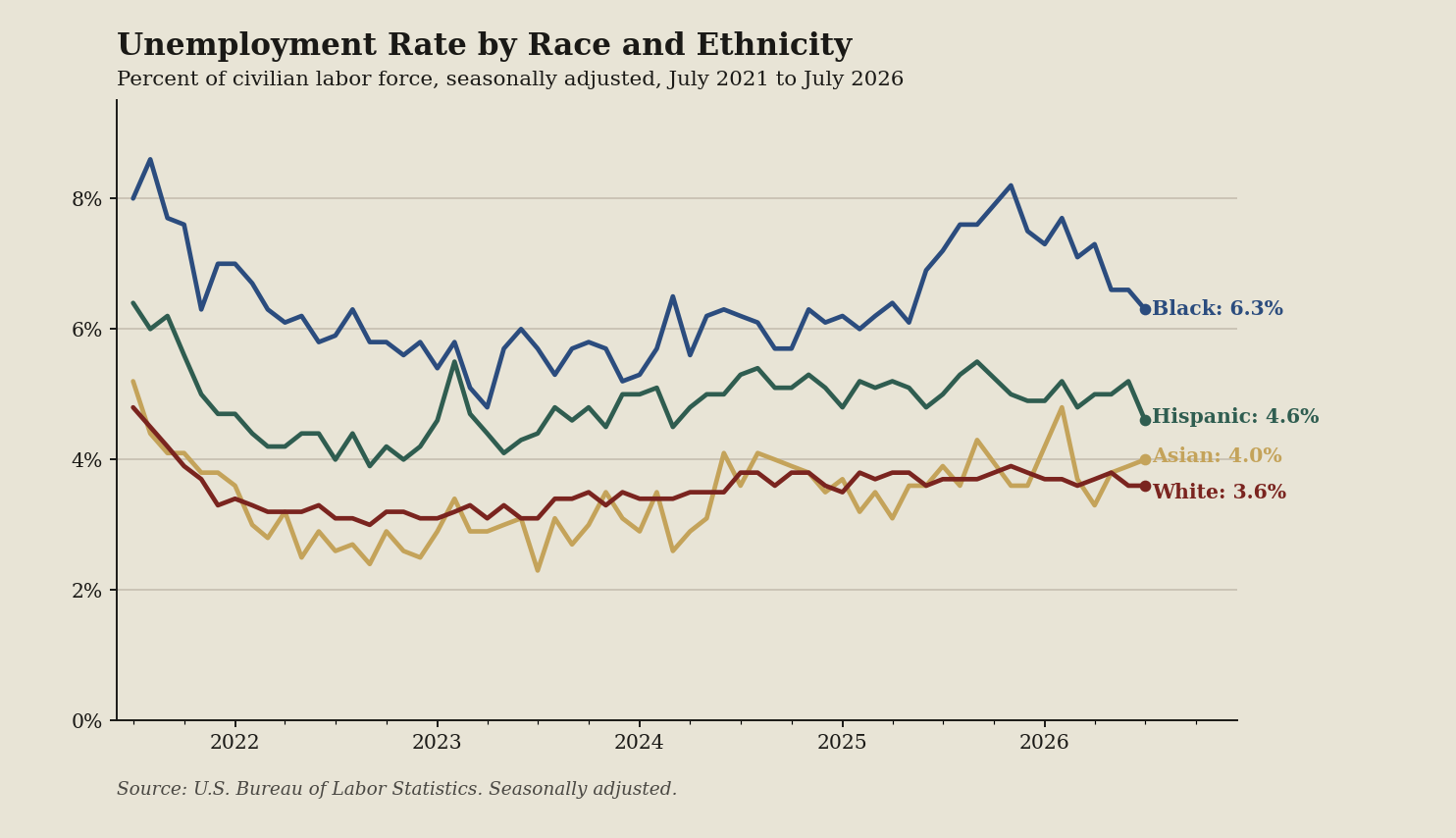
- White workers (dark red line): The rate fell from 4.8 to 3.6 percent over 60 months, signaling faster hiring.
- Black workers (blue line): Falling from an 8.6 high to 6.3 percent on this federal data page signals lasting search friction.
- Hispanic workers (green line): Dropping from 6.4 to 4.6 percent over the window suggests seekers face less market resistance.
- Asian workers (gold line): Moving up from 3.3 to 4.0 percent over the last four readings indicates suddenly tightening prospects.
What the terms mean
- The Employment Situation report: The government's monthly labor scorecard where these official metrics originate.
- Jobless rate: Active seekers unable to find work, detailed on the U.S. Economy at a Glance page.
- The Current Population Survey: The monthly household poll where analysts extract demographic data for these rates.
What to watch next
Do not treat a 4.1 percent reading from the Current Population Survey, a monthly demographic poll, as everyone's reality.